
HTTPS (HyperText Transfer Protocol Secure) has quickly become a standard way of securing websites, and it is critical that every business starts to switch from HTTP to HTTPS. HTTPS provides a layer of protection against theft and cybersecurity, keeps private and sensitive information safe, and also, Google favors secure websites and gives a ranking boost.
There are constant attempts to hack into data and engage in malicious activity. HTTPS is a proactive way of preventing cybersecurity breaches. This article by Amberd Design Studio will dive into the history of HTTPS as well as why all web pages should be switched to a more secure version of the protocol.
The History of HTTPS
HTTPS has been an evolving area for quite some time now. It started in the mid-1990s and has slowly expanded from eCommerce pages to other forms of data collection. Each development in the history of use has come from a realization that the scope of unsecured pages and possible malicious behavior expands beyond the page where data is entered.
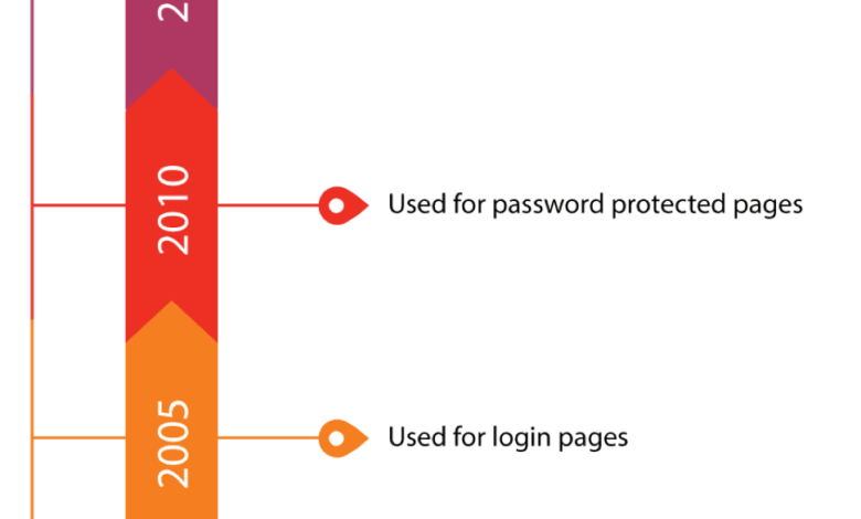
- In 1994, HTTPS was used only for eCommerce pages. This was for pages where people wanted to buy something over the internet and entered payment information.
- In 2005, the use expanded to password-protected pages. These pages contain data and pieces of information that need to be secured behind a password. If they need a password to access, the page should also be made secure.
- In 2010, the use of the protocol was expanded to all login pages. Before this, the login pages were not secure. The information entered to get to the login page was sending insecure information to a secure area before HTTPS expanded to login pages.
- In 2015, it became the default for all pages. This is because data privacy and integrity is always important!
The history of HTTPS has led to actions that bring us to where we are today, with a focus on all pages being secure. The reasons below provide a rationale and the support available to make browsing secure.
Reason 1
As the internet evolved and grew, people started putting more information online. Soon, there were entire datasets online that required a password to access information. If the information required a password, then the web communication for that page should also be secure.
This information that requires a password also has a login page, and if that login page is not secure, then an insecure request is going through to get access to a secure area. Some of the data that is placed online is extremely confidential, so security is of the utmost importance.
With HTTPS, passwords and other secure pieces of information are safe and encrypted from start to finish. This led to HTTPS being on the initial login page, the password sign-in page, and anywhere else that private information was needed.
Kaycee Basques states that “every unprotected HTTP request can reveal information about behaviors and identities of your users.” This is why even seemingly innocuous pages need to have HTTPS, as users can accidentally disclose private information.
Reason 2
It did not take long for the idea of using HTTPS on all websites to take hold. Now, if you go to a website, it is more rare for a website to not have HTTPS than to have it. This represented a shift in priorities where data privacy matters all the time. Using HTTPS removes a large opportunity for malicious activity.
Within four short years, the number of pages that loaded with HTTPS increased.
· In 2014, 26 percent of pages had HTTPS.
· In 2018, 68 percent of pages had HTTPS.
· Of the top 100 websites that number jumps up to 81 percent. This includes a number of extremely large and well-known companies.
This does not mean that it is seamless to make web pages secure by using HTTPS. Brendan Riordan-Butterworth emphasizes that “there is management overhead with acquiring certificates and making sure those don’t expire, increased resource requirements on servers to handle encryption, and other costs”. Browsers are making it obvious if your site is not secure so even with this overhead and management, it is an important trend for the future.
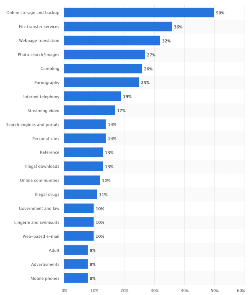
Global encrypted internet traffic increased from January to September 2015, by category. Source: Statista
Reason 3
Large companies have the resources, both human and capital, to handle a large task such as the process of changing every single web page into HTTPS. Smaller and medium-sized companies or individuals do not have the same level of support.
Because it was a shared goal to get as many websites to be encrypted, a movement was started that is called Let’s Encrypt. This initiative was started at the Internet Security Research Group. This group is a consortium that has the support of large technology firms. Their ultimate goal is to make sure that all websites are using HTTPS.
This was not hard for large companies with the resources to make the switch. For smaller companies or individuals running websites, the Let’s Encrypt initiative helped by:
- Offering free certificates
- Simplified the setup
- Provided maintenance for the certificates so that it was easier to make the move
This movement has led to over 50 million active certificates.
Reason 4
Web browsers have also played a part in encouraging the switch. Google Chrome has been leading this charge. This also includes the Incognito mode.
- In January 2017, Chrome started alerting the user to any HTTP page that required a password or credit card, but the page was not secure. This alert displays in the form of a large warning that tells the user the page is not secure.
- Following this, Google Chrome then broadened the scope of this warning message to show up on any page that requires the user to fill out information.
- In July 2018, a warning sign was placed in the URL box for any HTTP page that had not switched to HTTPS yet. Over time, this warning may become more pronounced.
Remember, the Let’s Encrypt project is making it easy for any website or web page to become secure, so small businesses will have the support to make the warning go away.
In Summary
In the world of technology, changes are happening at a faster rate all the time. These changes include both people who are using technology for good and people who have malicious intent. There are certain things that even those who use technology for good can do to prevent actions by those who have bad intentions. Securing all web pages is a simple step that businesses can take to increase the security of their website. Let’s Encrypt is a great opportunity for website owners!
Author Bio:
Emin is a web designer and a developer at Amberd Web Design Studio based in Los Angeles, CA. He loves blogging about web design, internet marketing, and anything design/art related. In his free time, he enjoys visiting museums like the Getty Center and the Los Angeles Museum of Modern Art.